My Patina
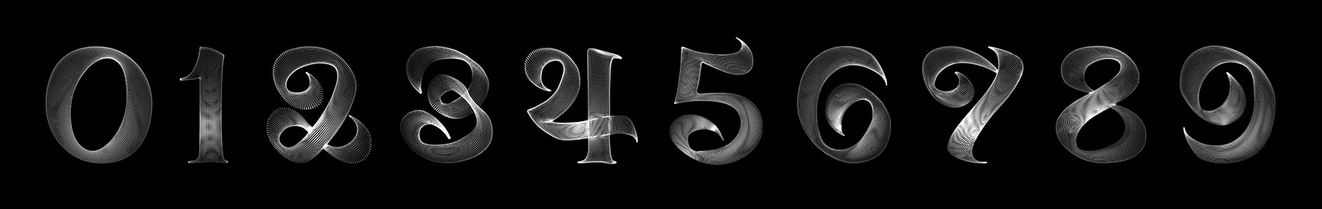
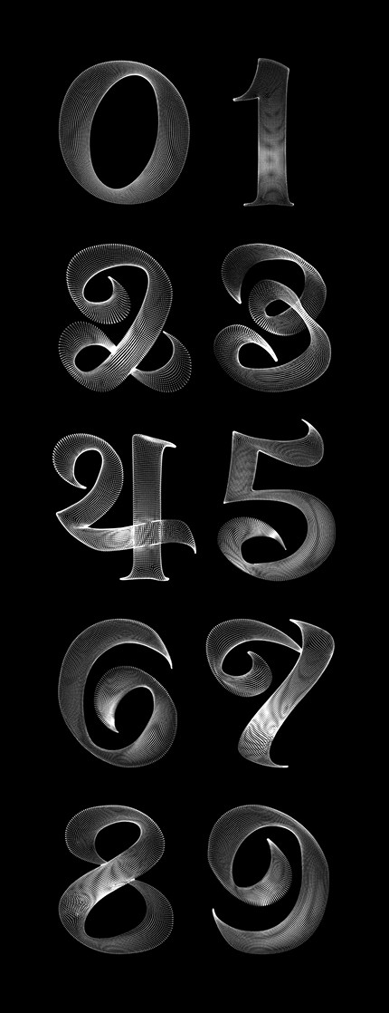
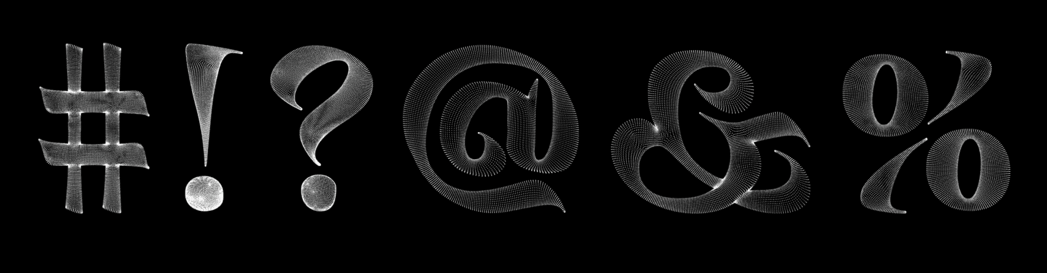
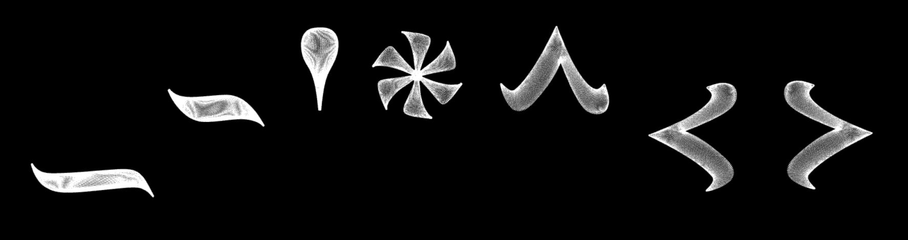
My Patina is a living typeface that treats aging as beauty, letting each letter wrinkle, sag, and soften over time like a body accumulating the visible marks of a life fully lived.
Year
2025
Duration
15 weeks
Scope
Typeface Design
Categories
Use
The aim of My Patina is to be used as a storytelling and statement typeface, not a neutral workhorse.
Why
It’s meant for moments where the message is about bodies, time, memory, or identity: posters, titles, exhibition graphics, campaigns, motion pieces, interactive experiences, and editorial spreads that want to visually challenge beauty standards and the fear of aging.
Interaction
As you move the cursor, you can reshape the body of each letter—from smooth to lined and sagging. The same way our choices, environments, and beliefs slowly sculpt our own bodies, whether we’re aware of it or not.

Structure
Each particle is a tiny memory, one moment, touch, or emotion suspended in space, that together build the full body of the letter the same way countless small experiences build a life.
Takeaway
The takeaway of My Patina is that aging isn’t damage.
it’s evidence.
The same way patina makes objects more beautiful, every line, shift, and irregularity in our bodies is a record of a life fully lived, and worth honoring instead of erasing.